
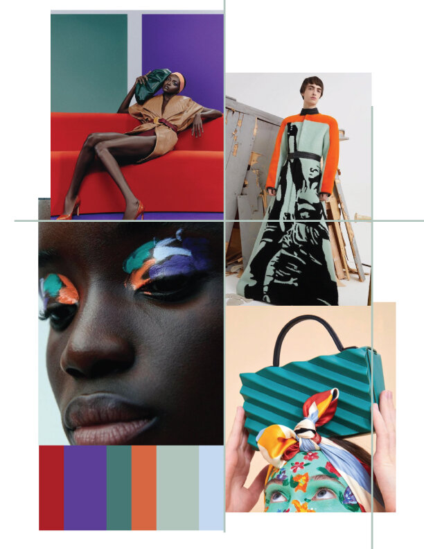
Winter/ Resort 22-23 Color Palette
Created by Nalini Arora
Everyone is talking about how they’re itching to go out. The pandemic has us all feeling tired of sweats, sneakers, and “ house “ slides. The vaccine is here, and giving many hope that life will resume in a new light. It will never be the same as before. However, there is a feeling of a light at the end of the tunnel.
Color will be a form of expression. With the pandemic, as a society, we’ve experienced a lot indoors. We’ve reflected on what and who is important to us. One prominent discovery I have noticed is loving our earth and discovering options to treat our planet with love and not wastefully. Shopping consciously is top of mind. We buy pieces that will stay in our closets for a long time, shop vintage and second hand, and will accessorize to add something special.
For Winter/Resort 22-23 , I’m feeling brights such as red, purple, turquoise with touches of orange, sage, and light blue. Fun prints mixed in with classic colors, and of course print on prints is something I love but am hesitant to wear. I love seeing influencers like her , her, and her wear brights. Personal stylist Jemma Cotterrell does. a color chart for you. I’ve honestly been considering it because I’m always wearing black!
Just looking at this palette gives me a feeling of happiness and hope that I foresee for the future!